
Development and Implementation of Brand Platform, Brand Strategy, Brand Identity, and Marketing Assets.
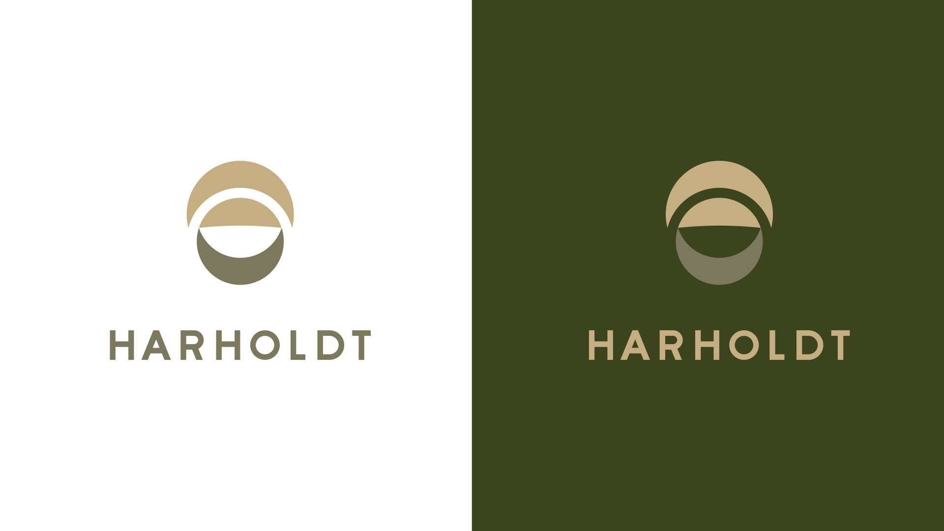
Harholdt Mediation and Law is a law firm that prioritizes empathy and trust.
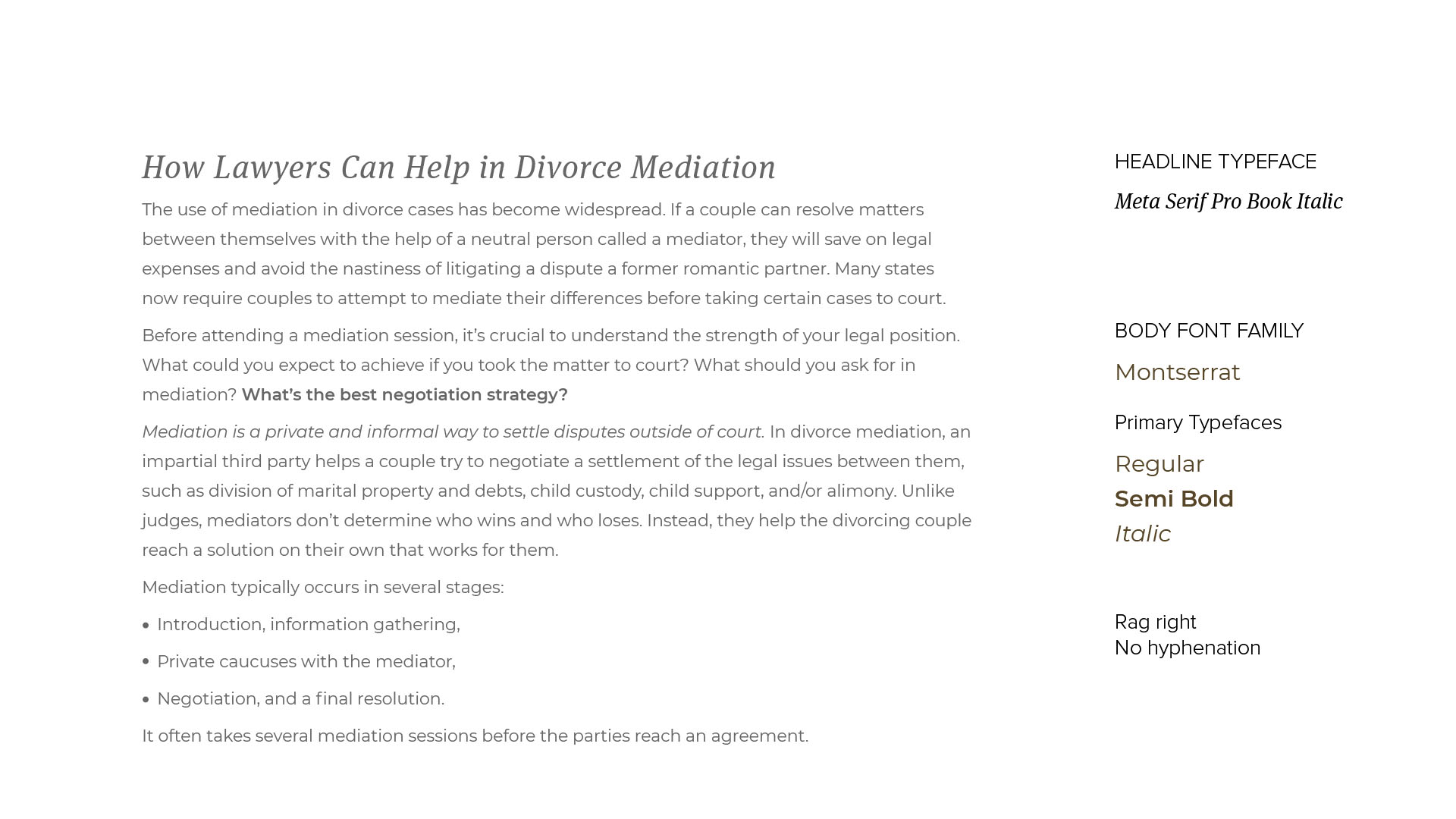
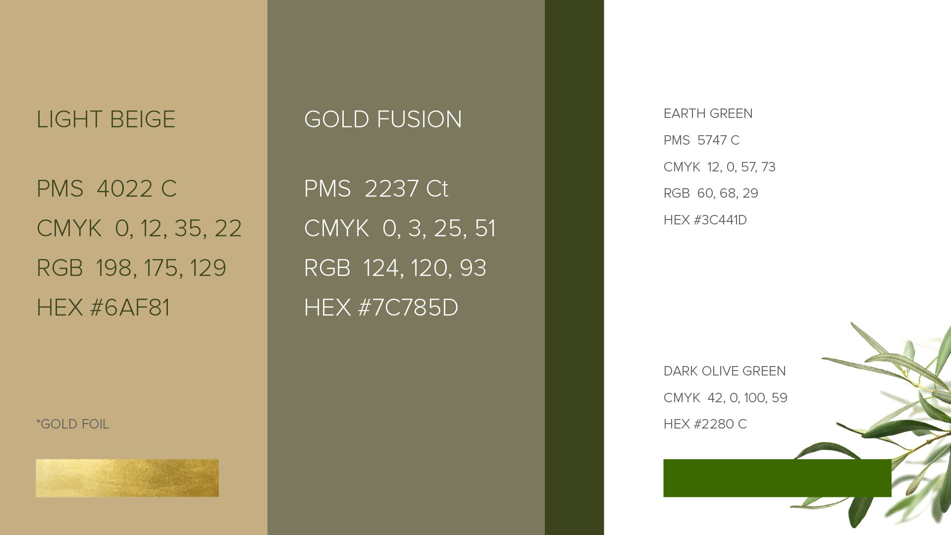
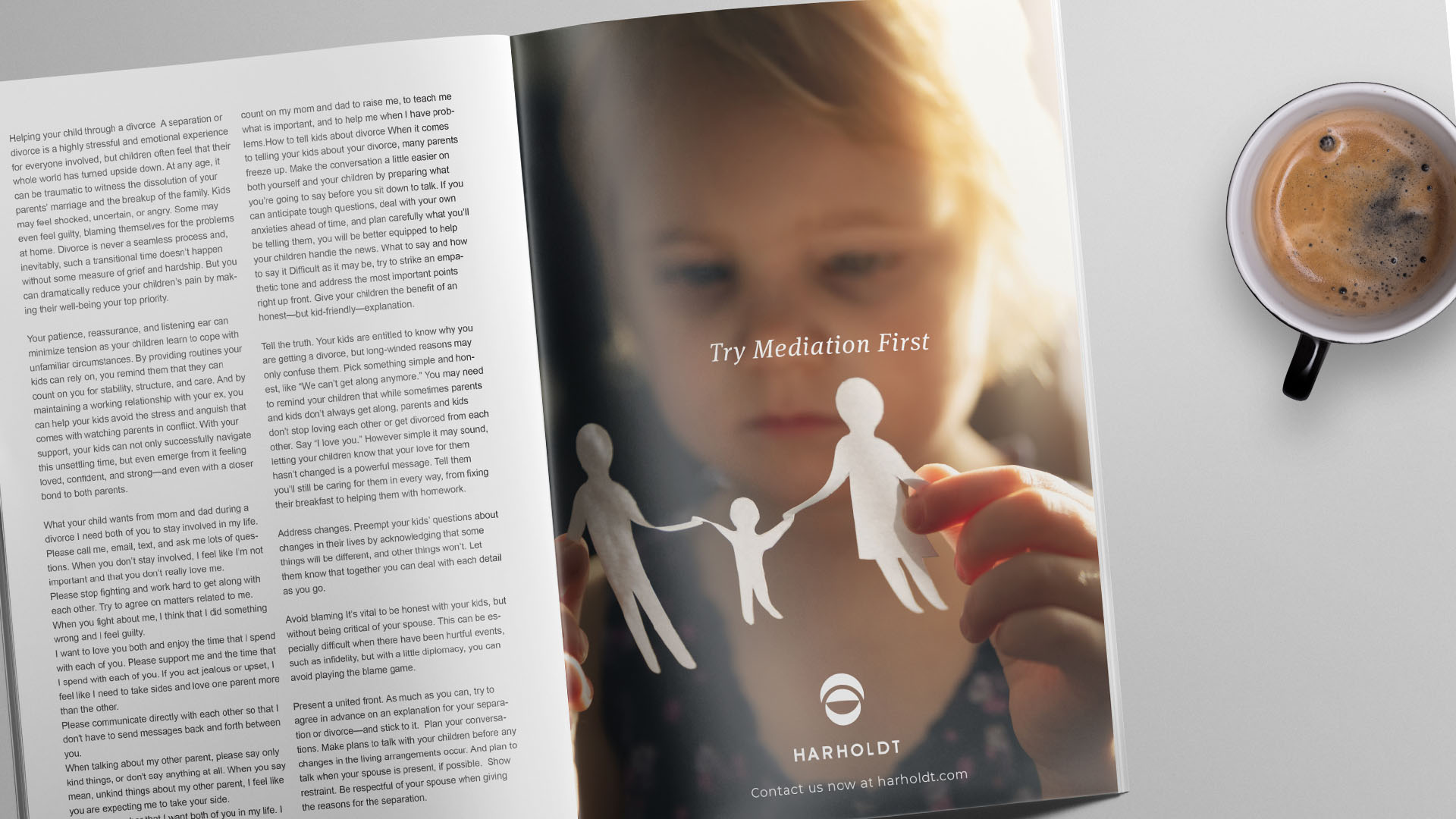
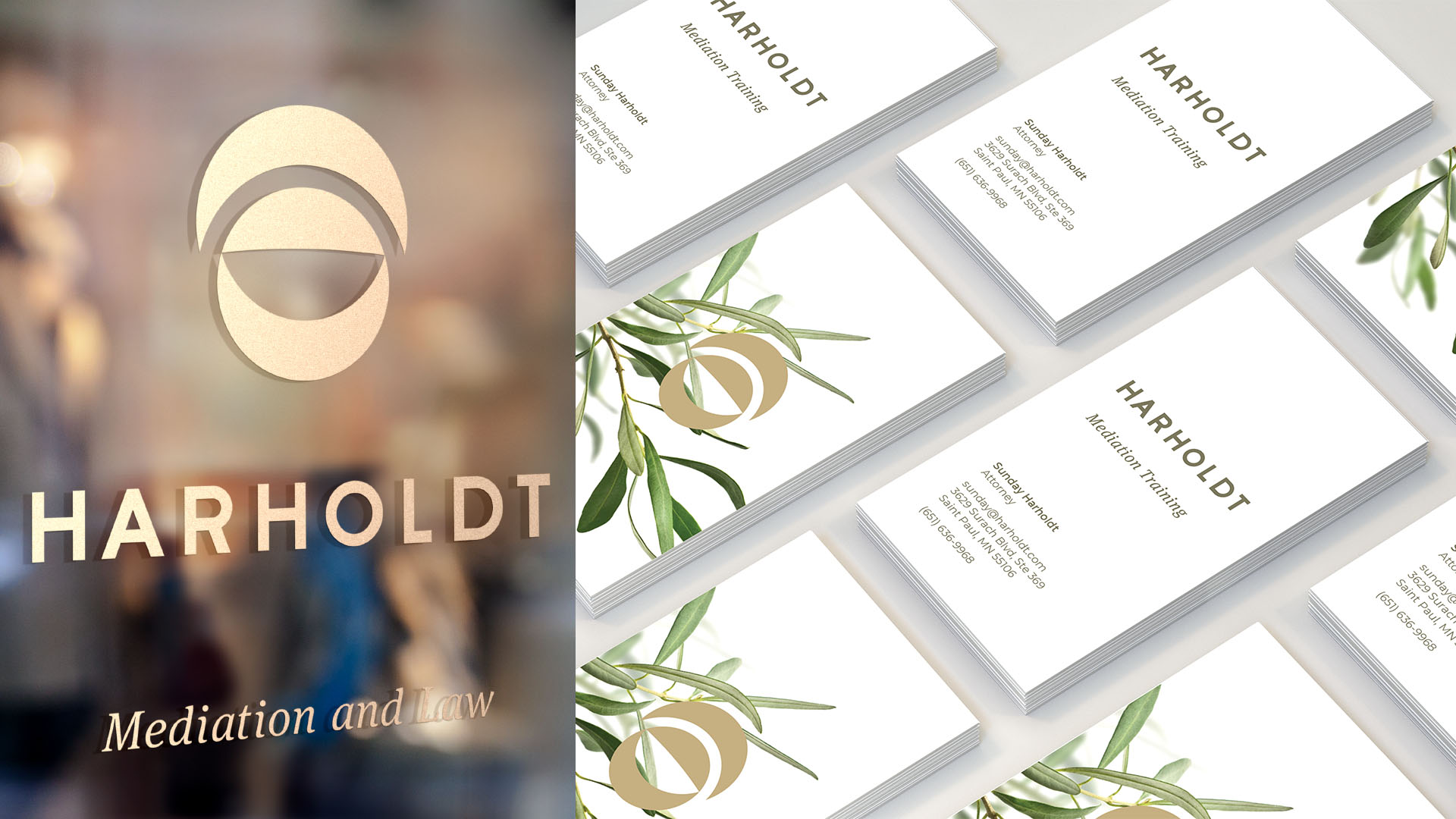
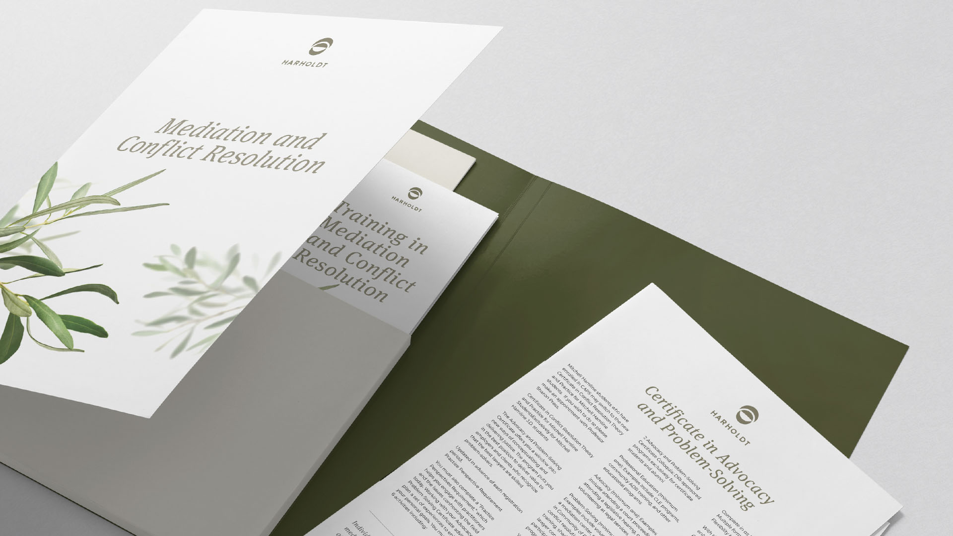
Together, with the client, we built a brand that subtlety conveys all the symbols of trust, empathy, and authority. As a result, provided to the client was a brand kit that establishes an over-arching brand that substantiates the business and two visual families (that stay within brand) that lean into empathy or authority.

WE LEANED INTO INDUSTRY SYMBOLISM
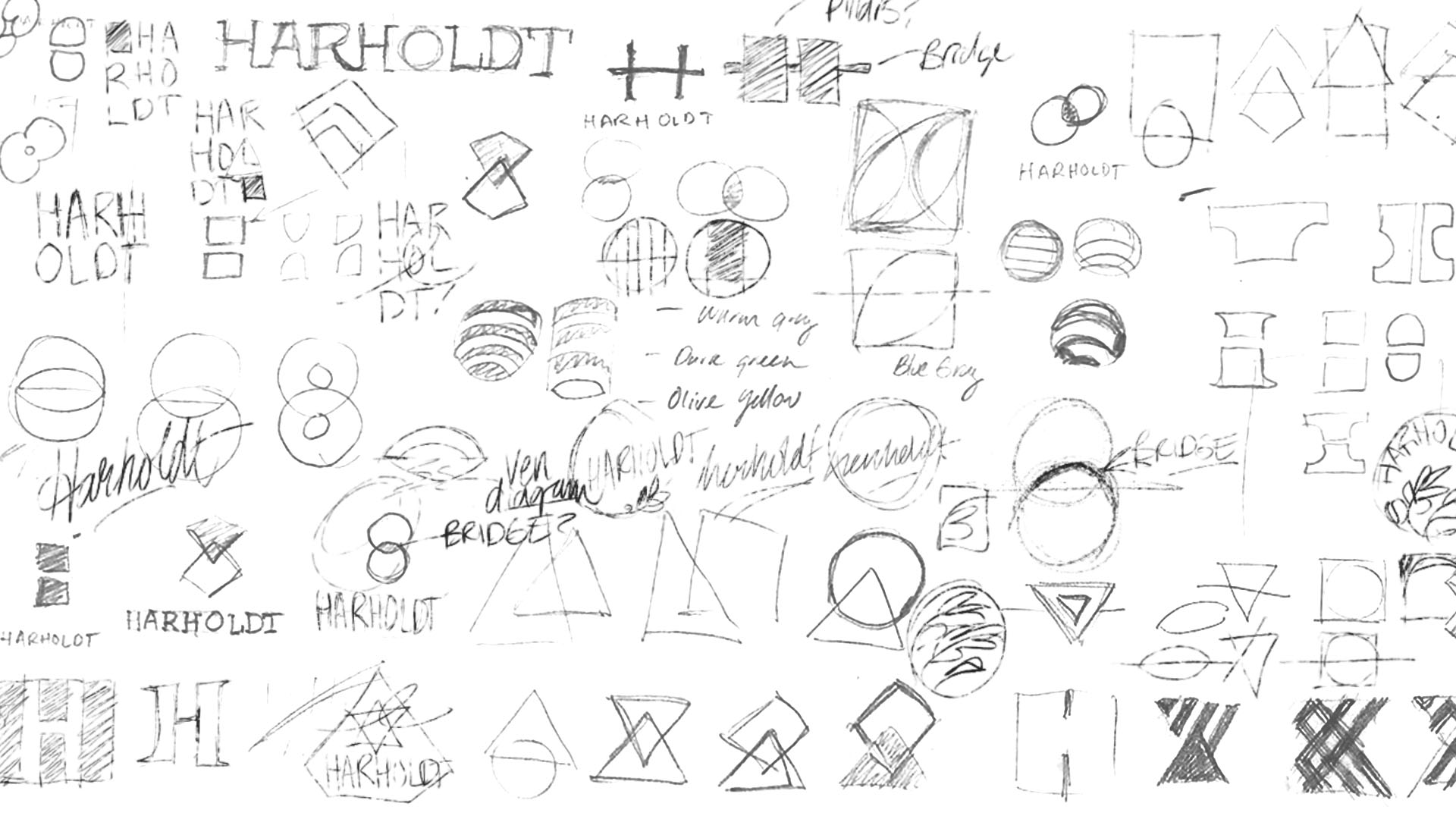
Law and mediation is an industry that is saturated in symbolism. Sometimes the symbolism is expressed well; but often not. Our natural inclination was to move away from this symbolism and create an abstract nonrepresentational mark. But after our workshops and research, it was determined that the symbolism is familiarity and validation to the customer.
So we leaned in.
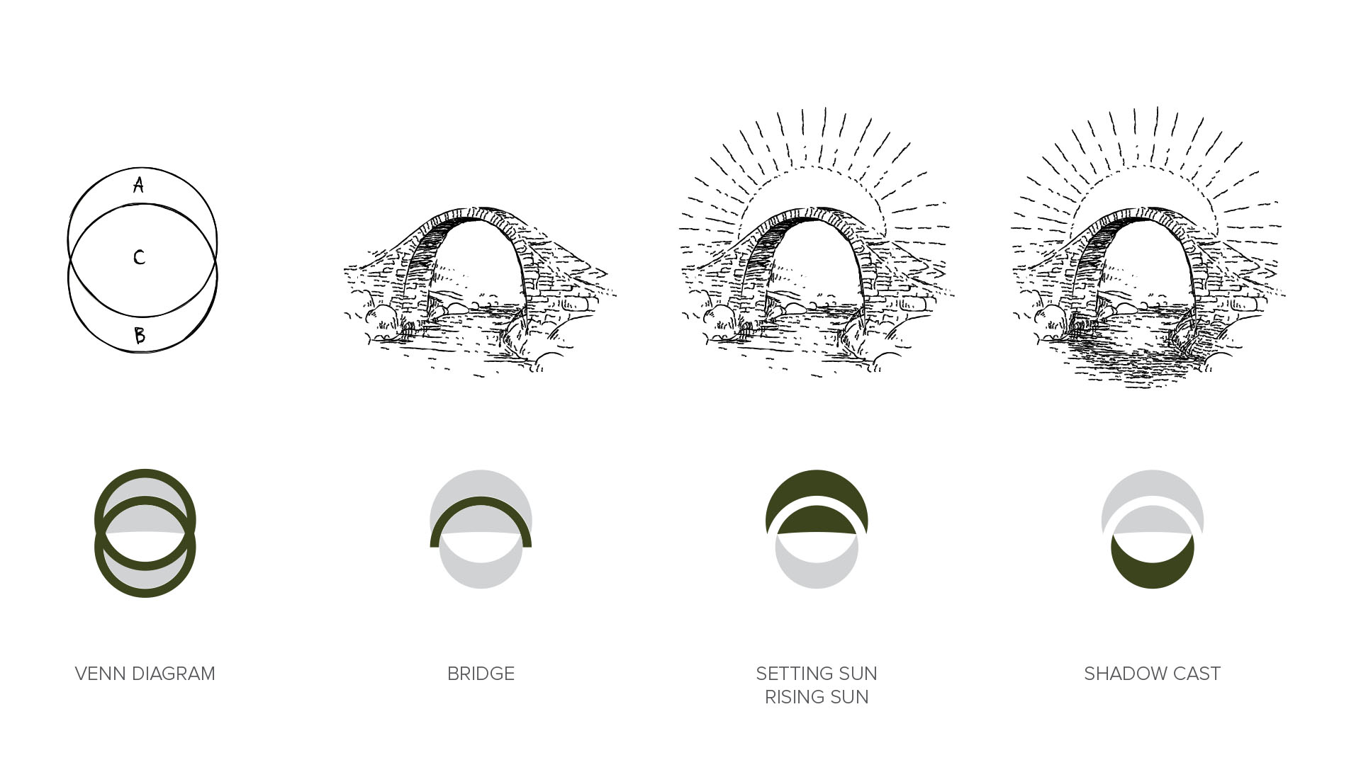
The logo is mash up of several symbols that express the services mediation and law with a special attention to a minimal balance as a result.
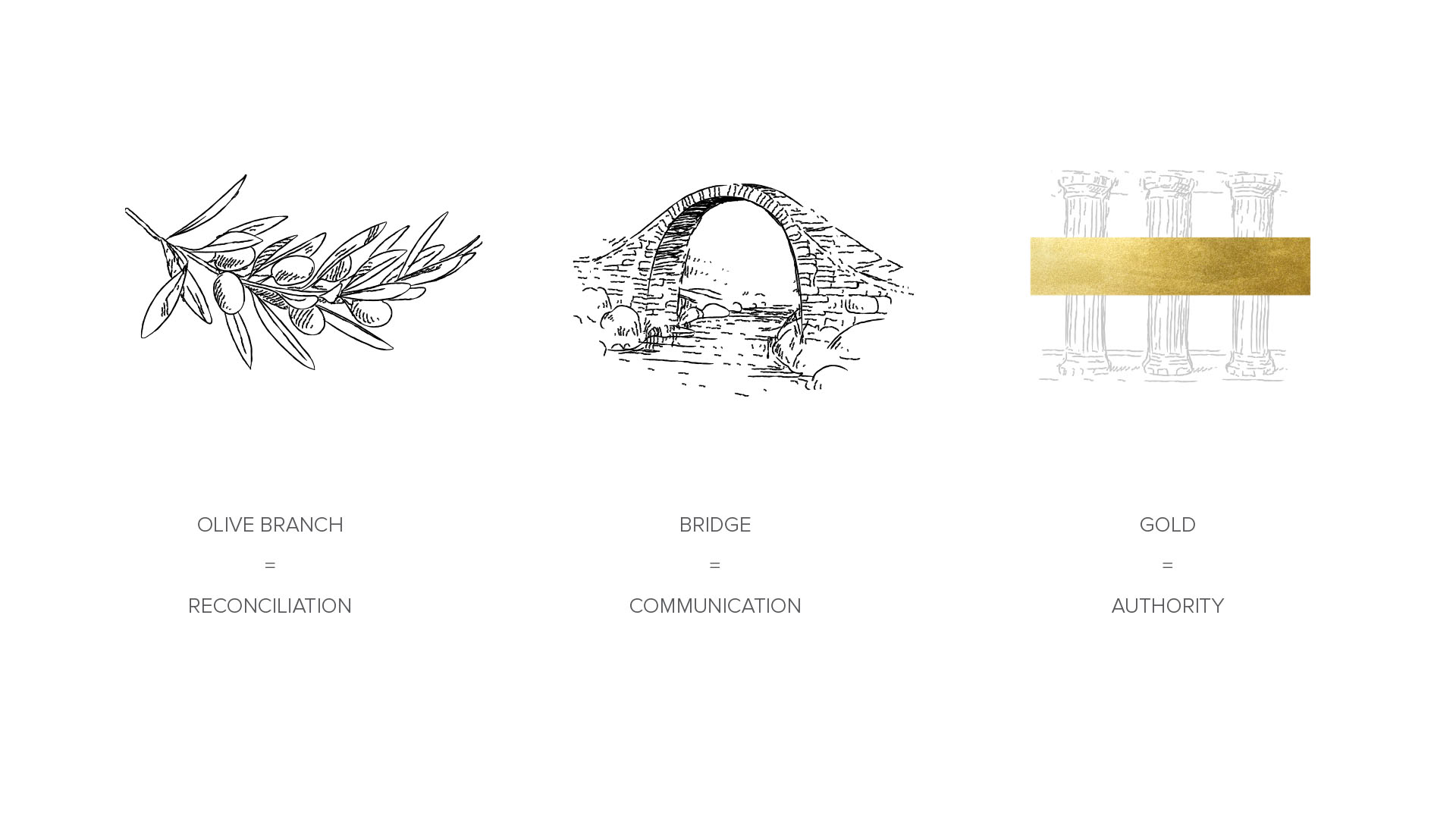
We created three visual cues within the brand kit, that represent the most important parts of the Harholdt mission; reconciliation, communication, and authority.


EPILOGUE
I loved this project because it was a challenge. Sometimes business opportunity creates branding issues.
The client was walking a natural entrepreneurial path, but as she evolved her established customers got confused. This made her want to explain herself. Which confused her potential customers.
What a pickle.
This is why I depend so much on workshops and research before the creative starts. There is always a solution, we just have to come to it together.
After a number of workshops with the client I discovered a business that has a lot of great services, a ton of potential, and extremely passionate people (especially the founder, Sunday Harholdt). We just needed to organize and build a brand that can work with all the restrictions and opportunities.
The result was a strong and robust brand package.


