Development and Implementation of Brand Platform, Brand Strategy, Brand Identity, and Marketing Assets.
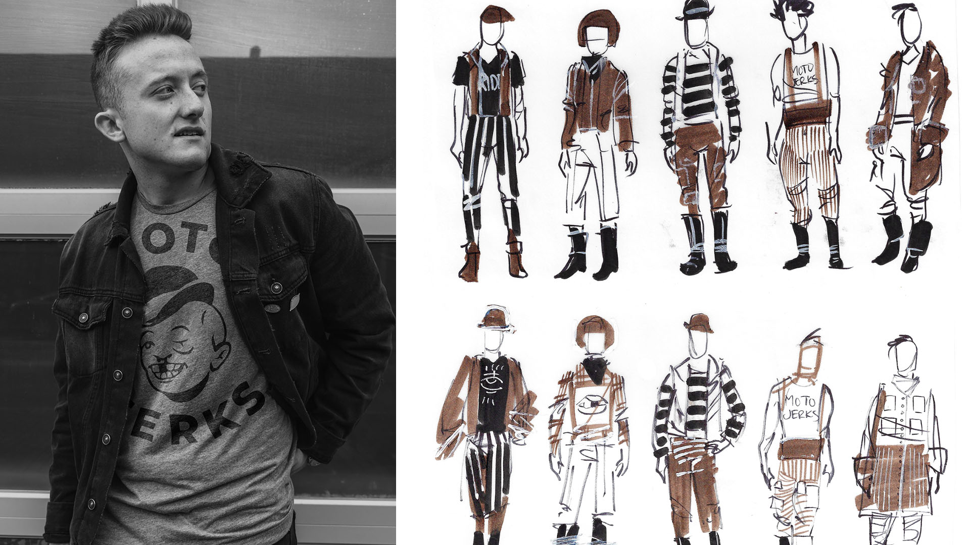
Moto Jerks are a clothing line that can take a beating. This company has a linear history, originating as a scrappy moped gang, and resulting as a passionate clothing company that strives to provide a product that endures. Moto Jerks had approached Hiarki Design Co. with a desire to separate the moped gang from the clothing line, yet keep everything that makes it unique.
The founder of Moto Jerks and her friends simply make clothes they want to wear. Clothes that look good and clothes that can last while riding hard.
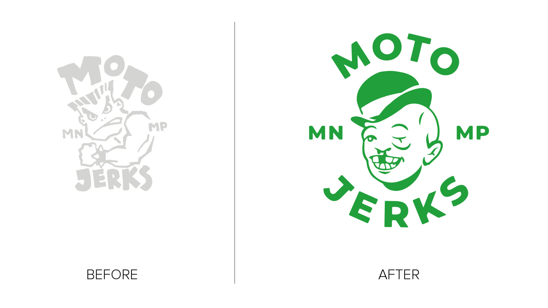
The original logo was a direct rip-off of a logo from the founder's past. Of course, this is a no-no. But it was a great place to start our conversation. After inquiring why this mark was originally..pirated, the founder had a multitude of wonderful aspirations and motivation in response that ultimately inspired the rebrand. The following are a few quotes from these meetings:
"...look Doug, I want them (customers) to know that this girl (referring to clothing) is the type that will take a punch to the face. And then she'll pick herself up, spit out her tooth, and laugh in your stupid f***king face. y'know what I mean?"
How can you not be inspired by that?
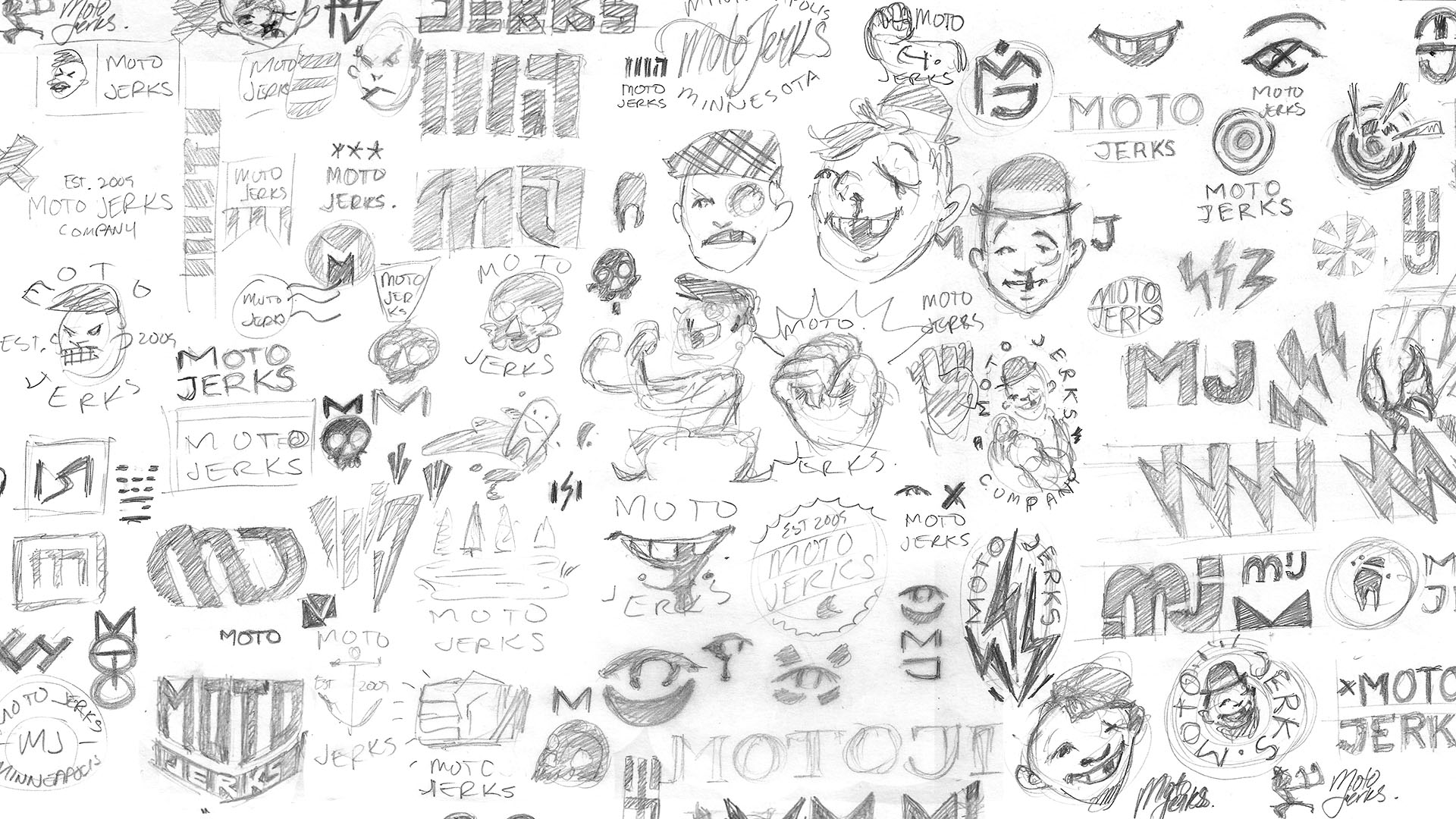
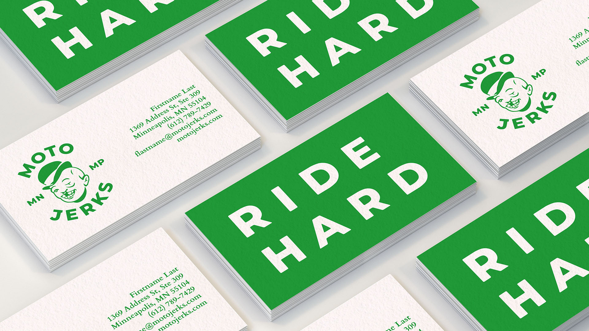
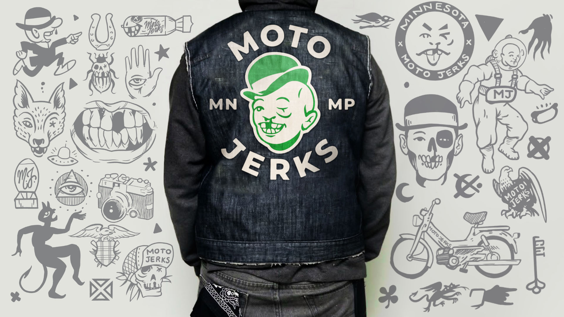
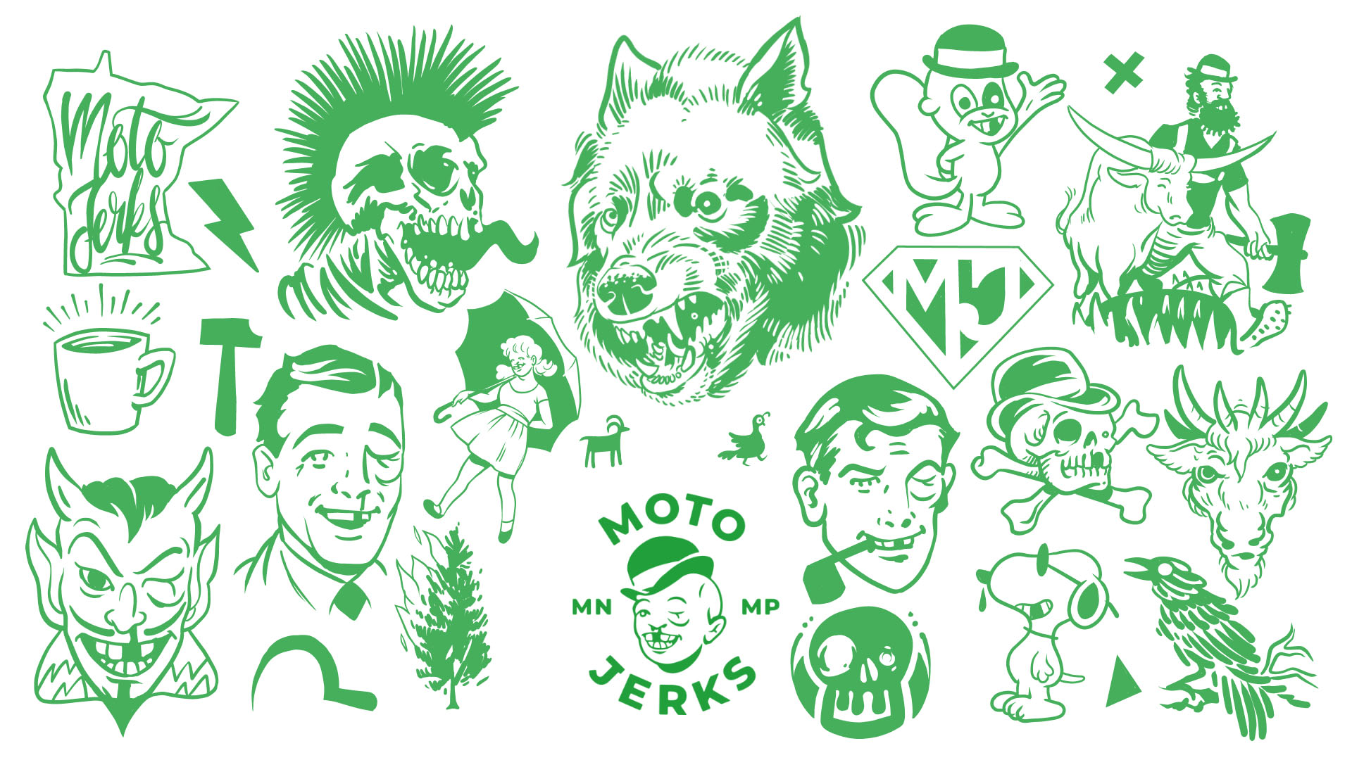
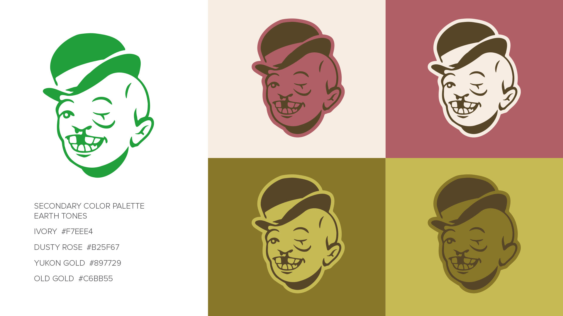
And so the logo was re-invented with special attention to the mascot, now named "Rough Ralphie" to customer's delight.
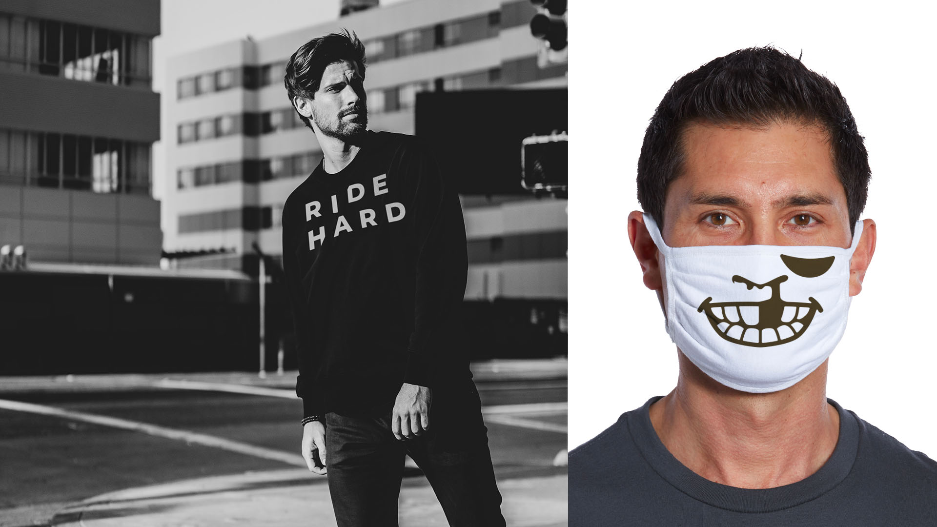
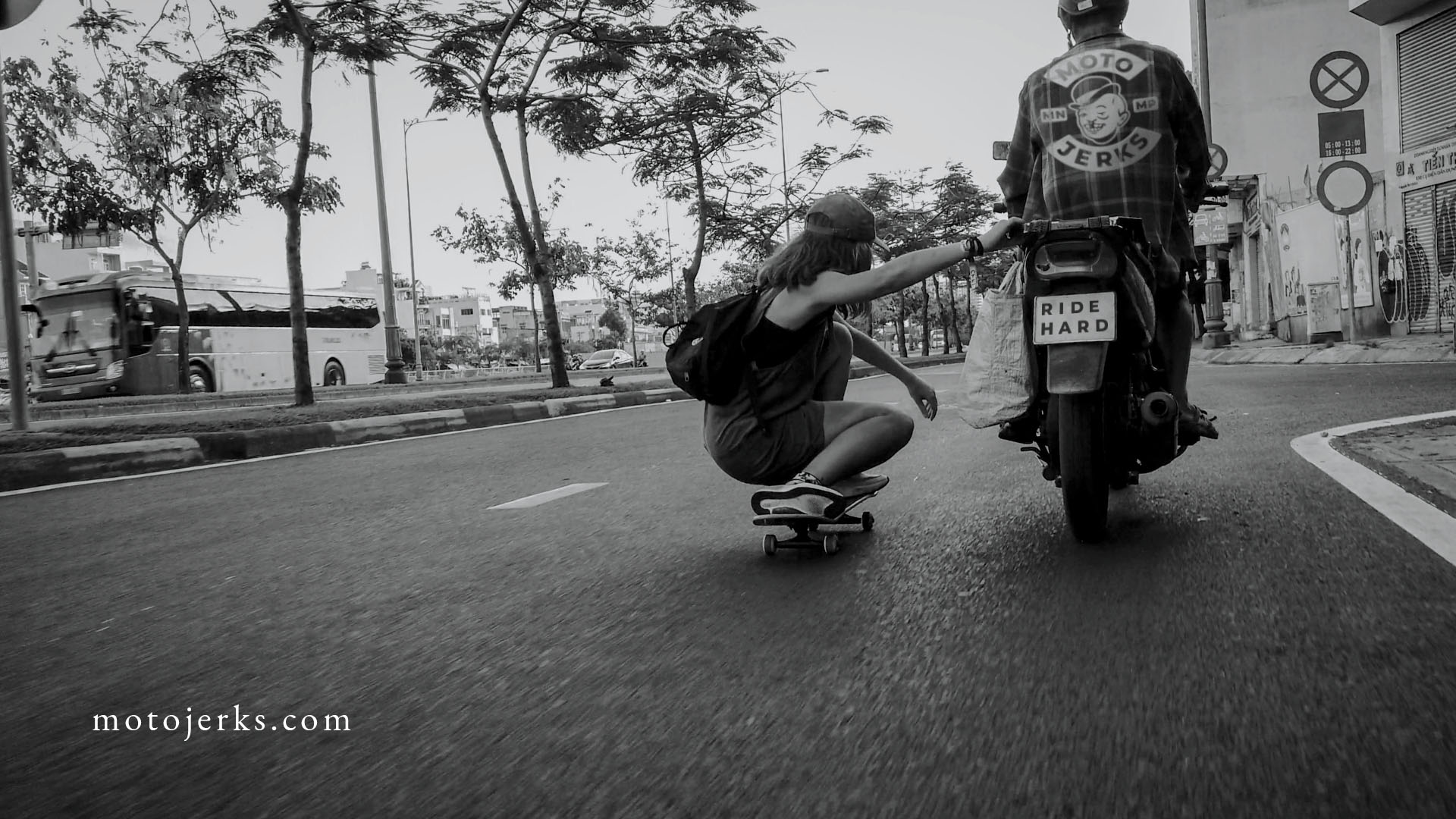
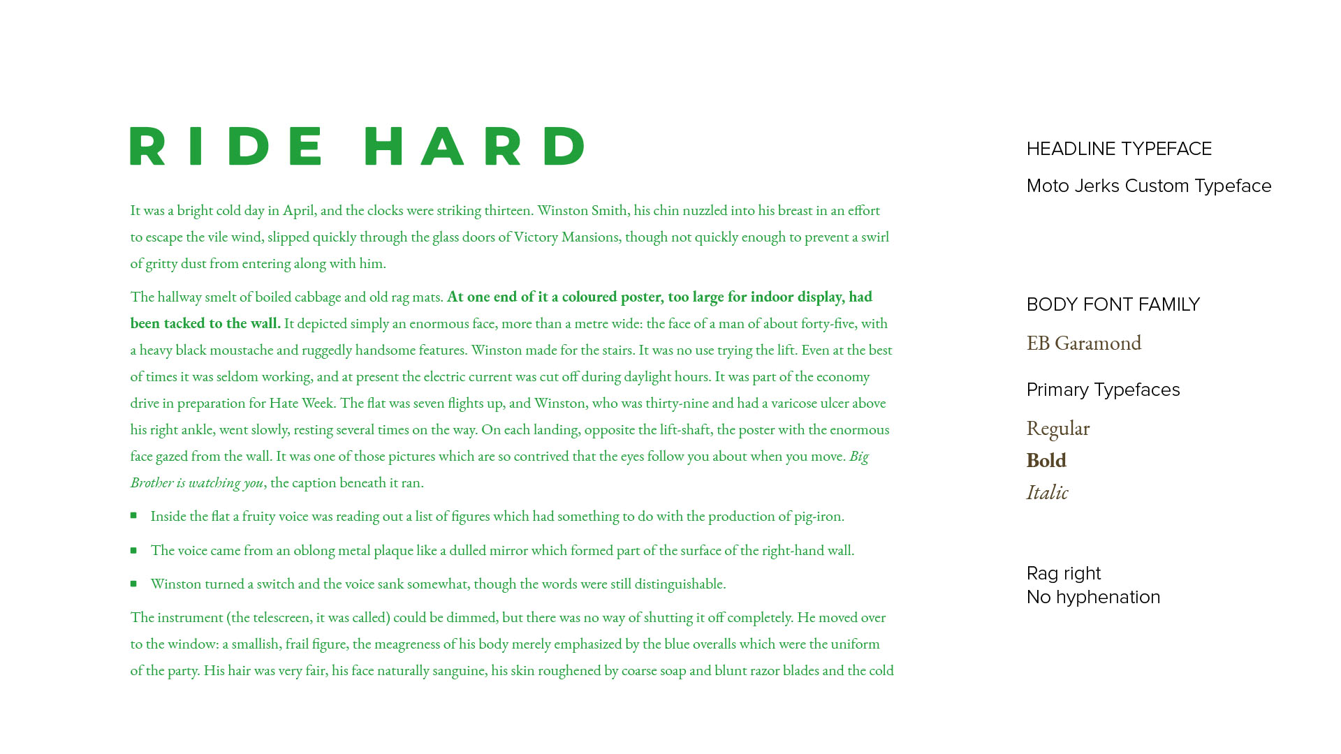
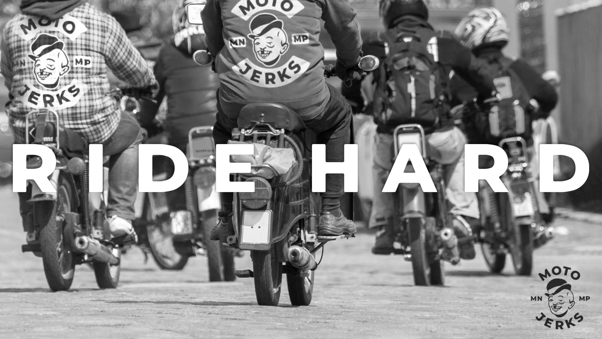
The new logo is a symbol and testament to the new slogan, Ride Hard.
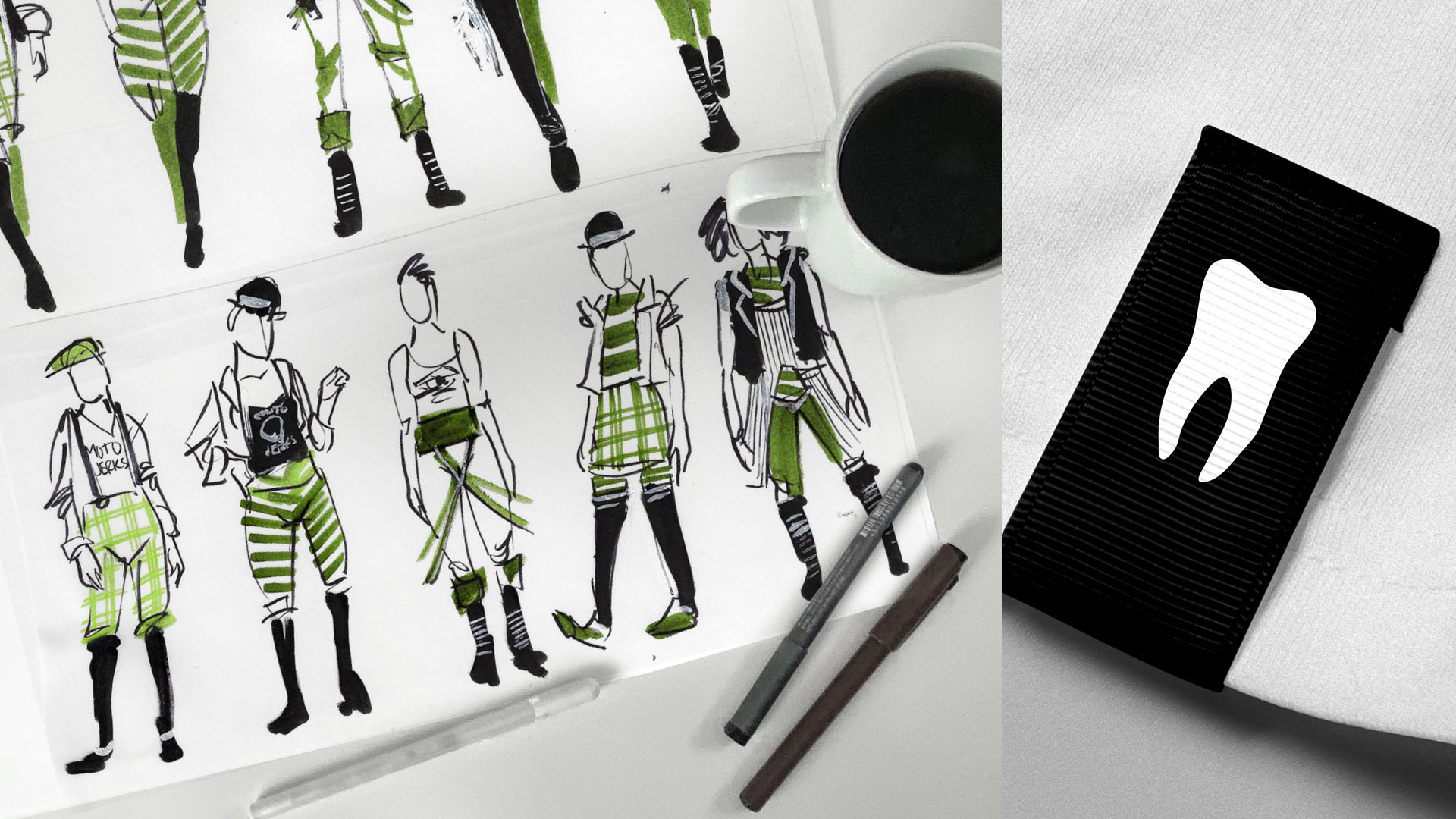
As symbolism is especially important to the customer, the logo is broken down into three identifiers that in combination is Moto Jerks; a black eye, a bloody nose, and a missing tooth. The customer was especially delighted when we pointed out that with a marker you can pirate any print ad by modifying that model with the Moto Jerks identifiers (black eye, bloody nose, missing tooth).
Not that we would condone this behavior.
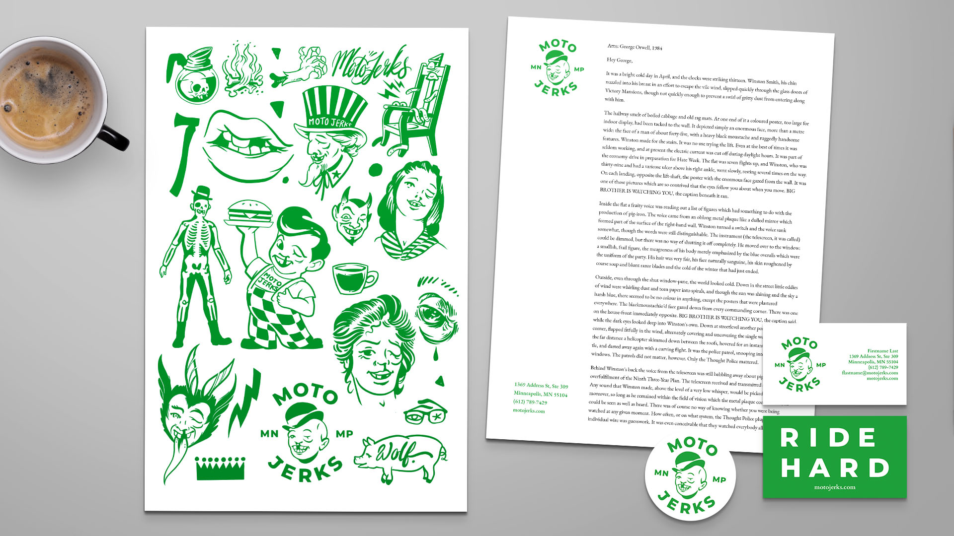
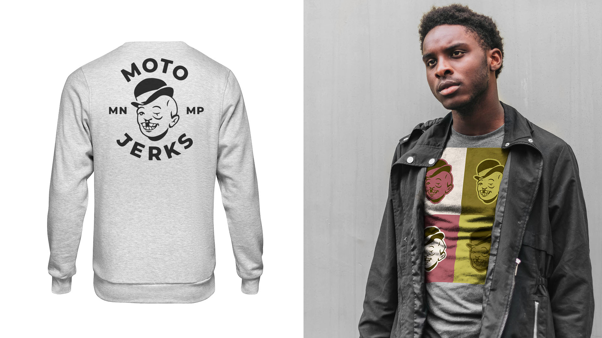
The rebrand comes at the perfect time for the Moto Jerks as they move into their next phase of clothing.
