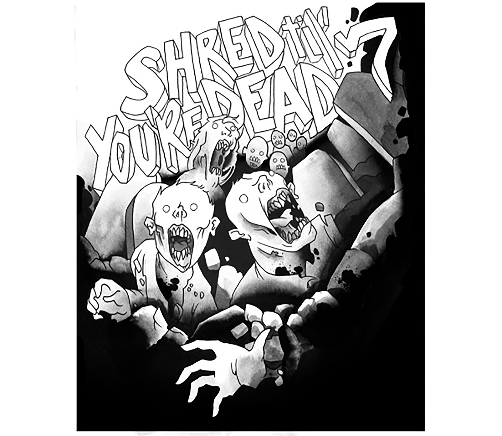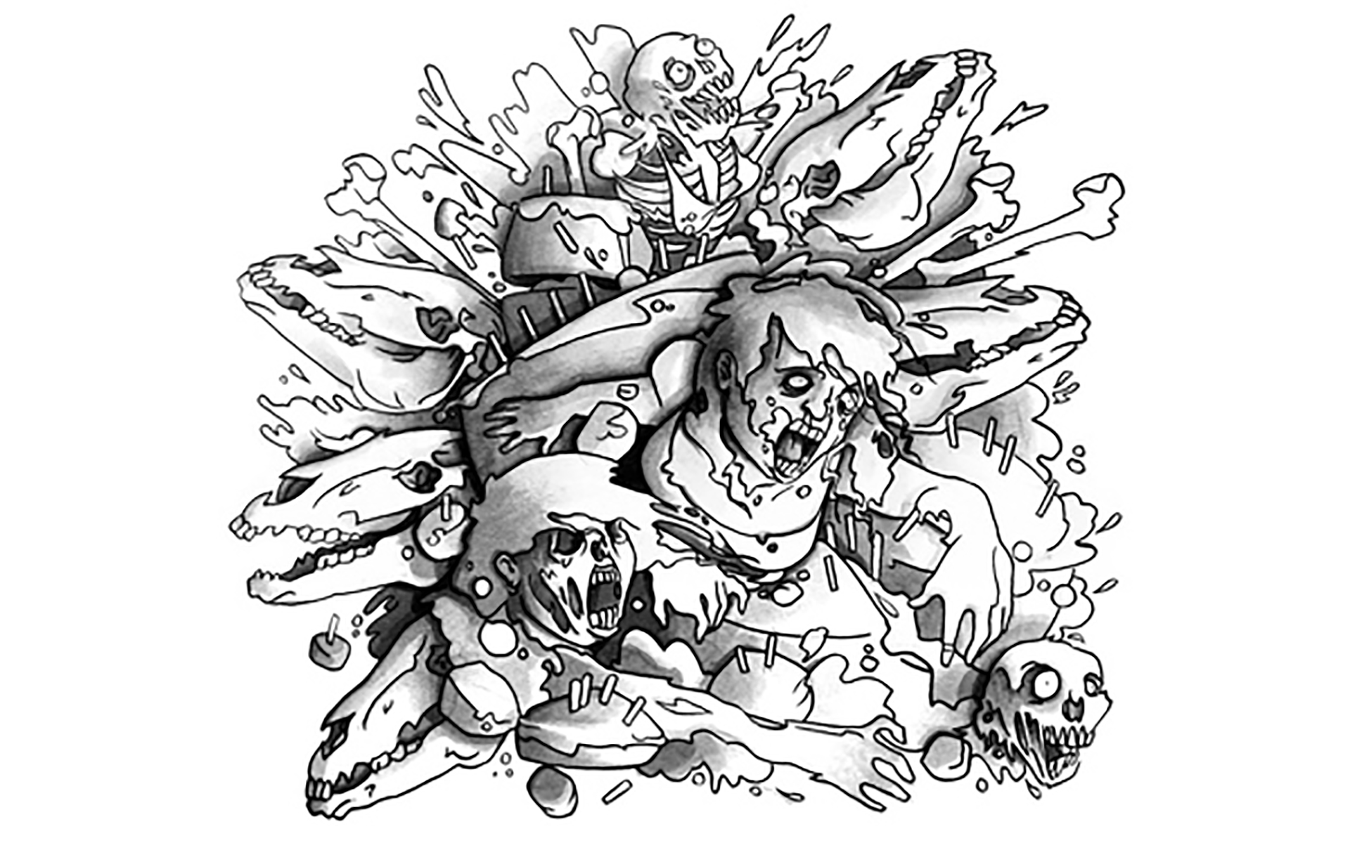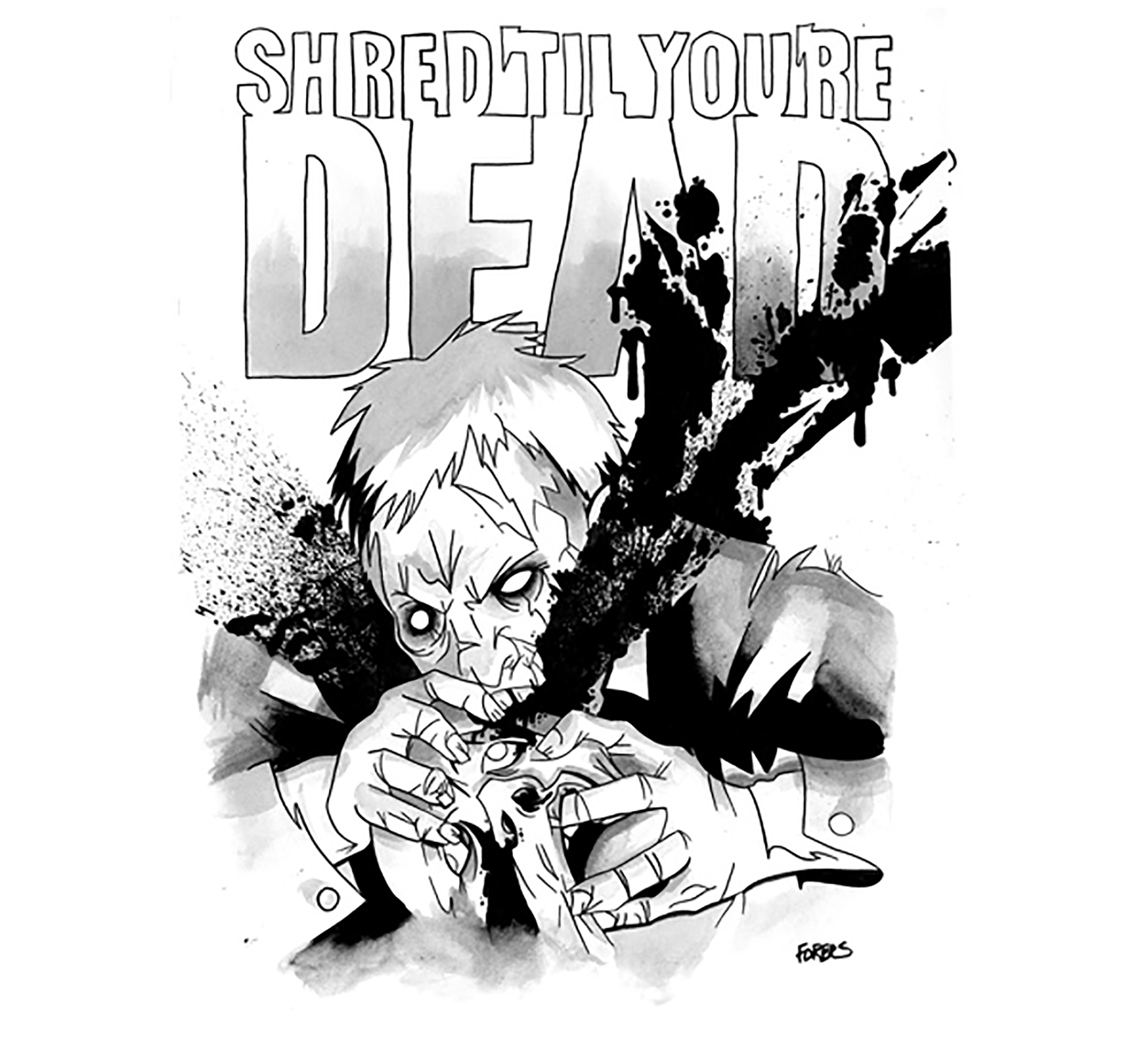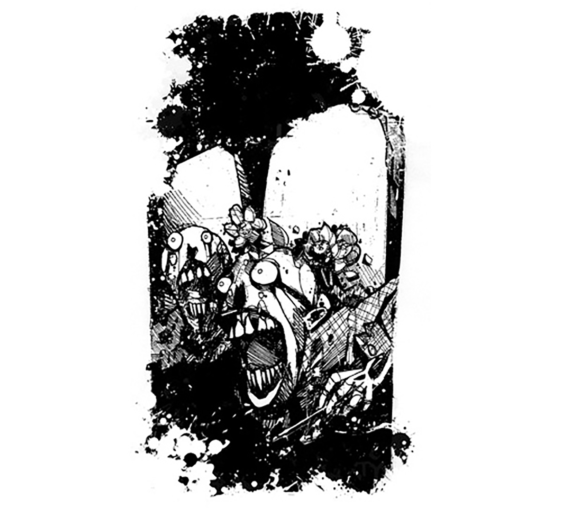
Campaign Components: logo, campaign identity and guideline, mural, clothing, sell sheets, print advertising, promotional items (swag), promotional vinyl stickers
Client Link: www.zombieboardshop.com
After the initial conversation with the client, we decided that to compete with big snow board and skateboard chains we had to develop a strong and recognizable brand presence. We wanted to be cooler than the competition by showing grass roots (as opposed to selling out) and establish strong brand loyalty.
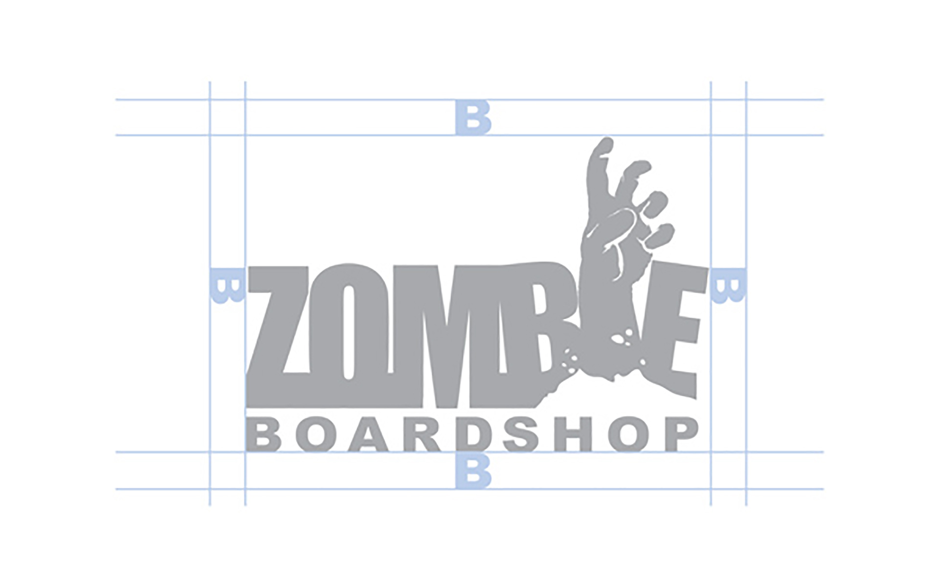
The logo was created as a strong and recognizable symbol while still being legible at distance.
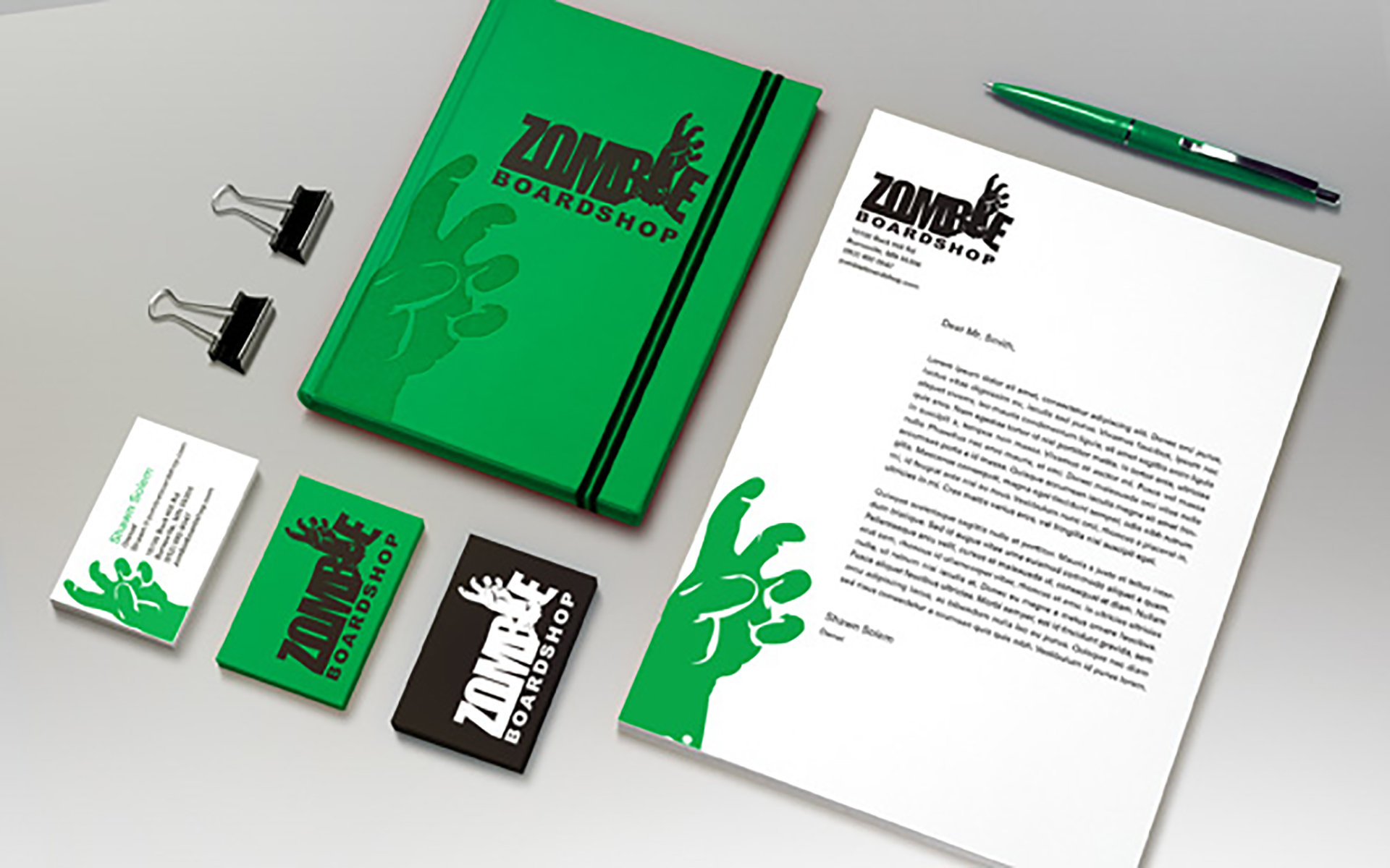
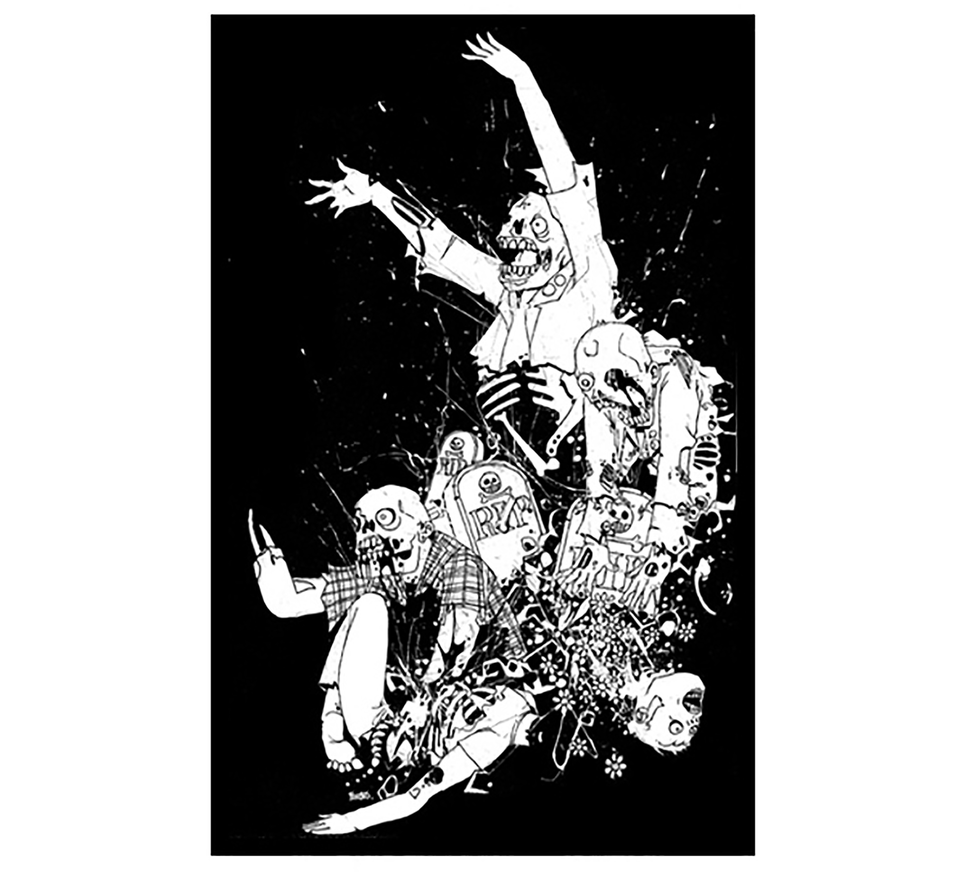
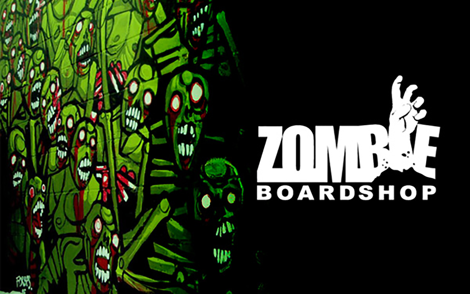
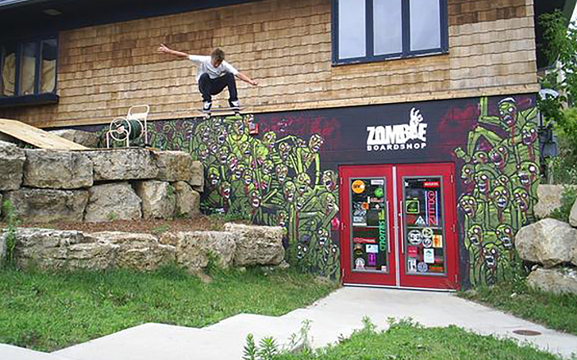
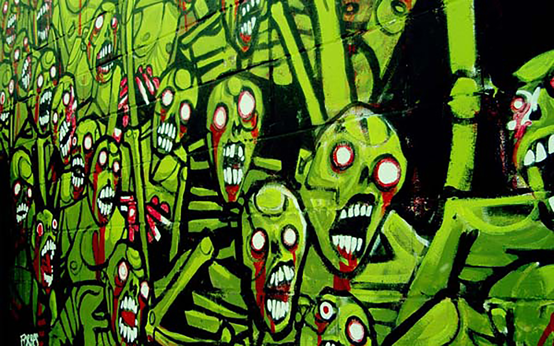
We created the logo as a foundation and then created the rest of the products with grassroots inspiration. We leaned heavily on my illustrative work to accomplish this. We had created the mural in a painterly style. This separated the spray can style that the bigger chains have claimed. All fliers and other event materials I used ink and watercolor illustration. Again, separating from the competition's Photoshop style materials.
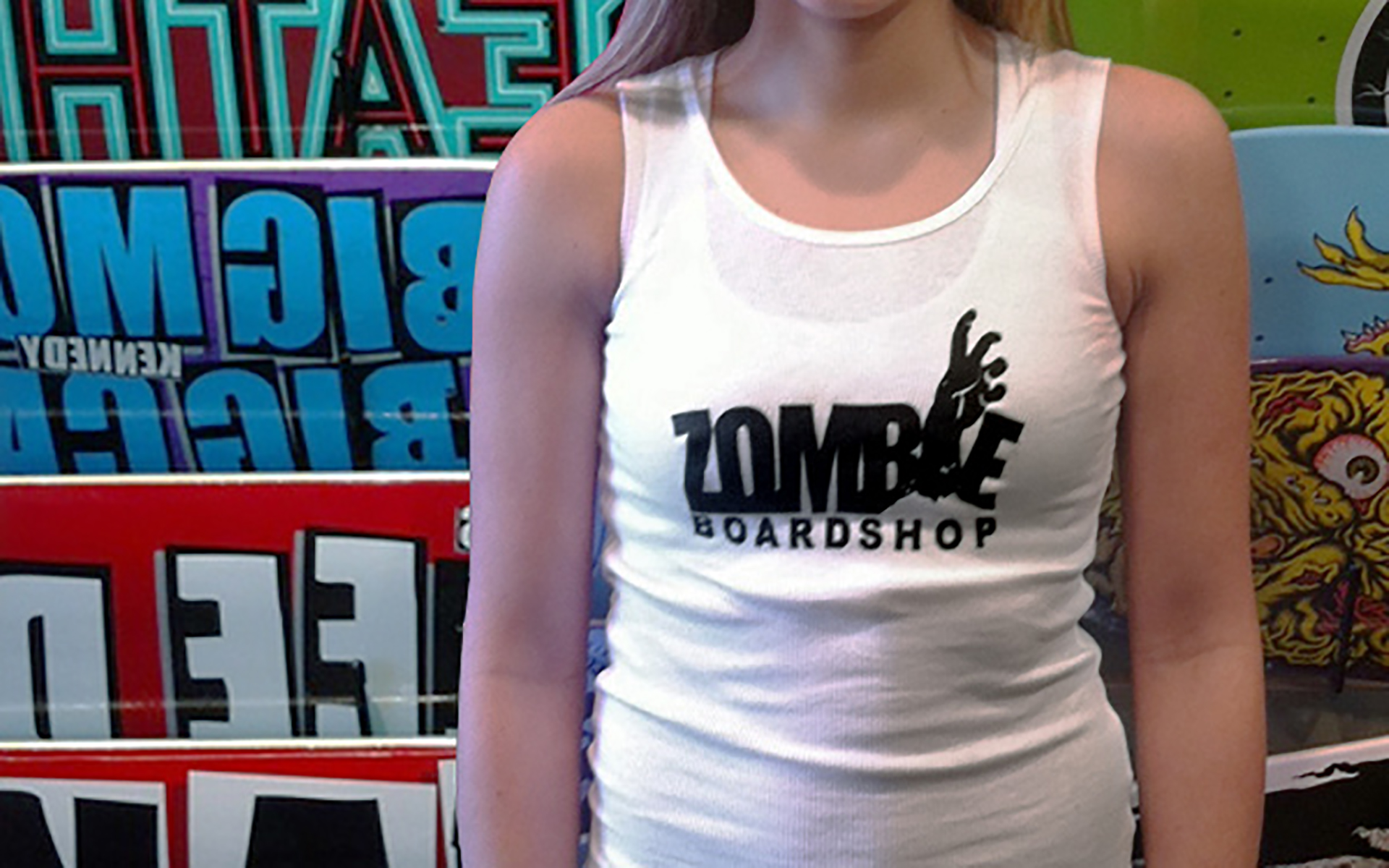
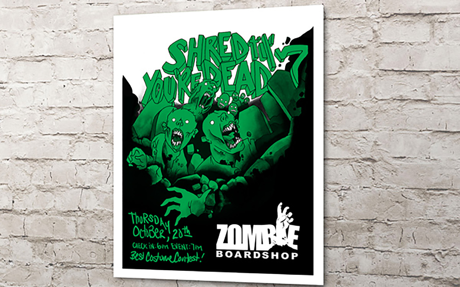
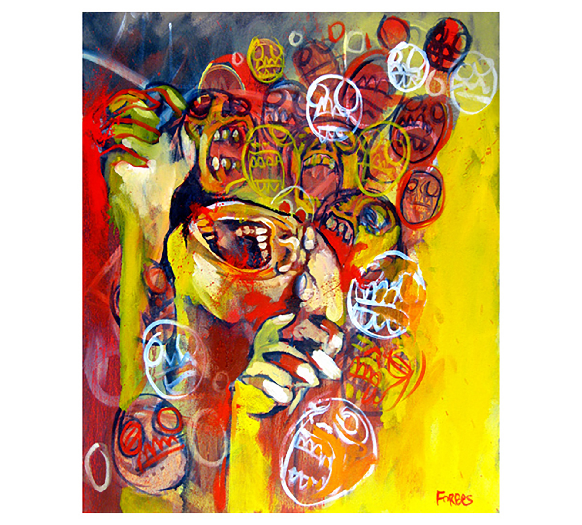
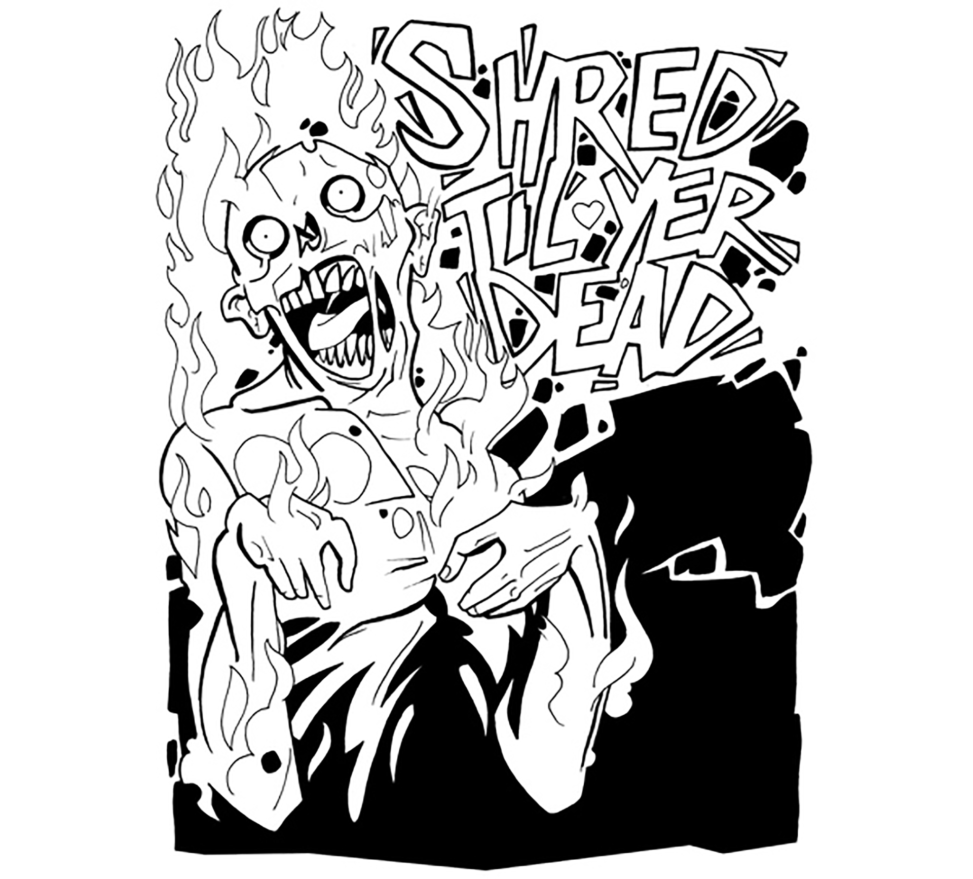
We were later hired by the client to produce illustration for several products and campaigns.
